What's the verdict?
Brands in Ireland don’t come much more iconic than Guinness; the distinctive harp has been associated with the black stuff since the 19
th century and is recognisable around the globe.
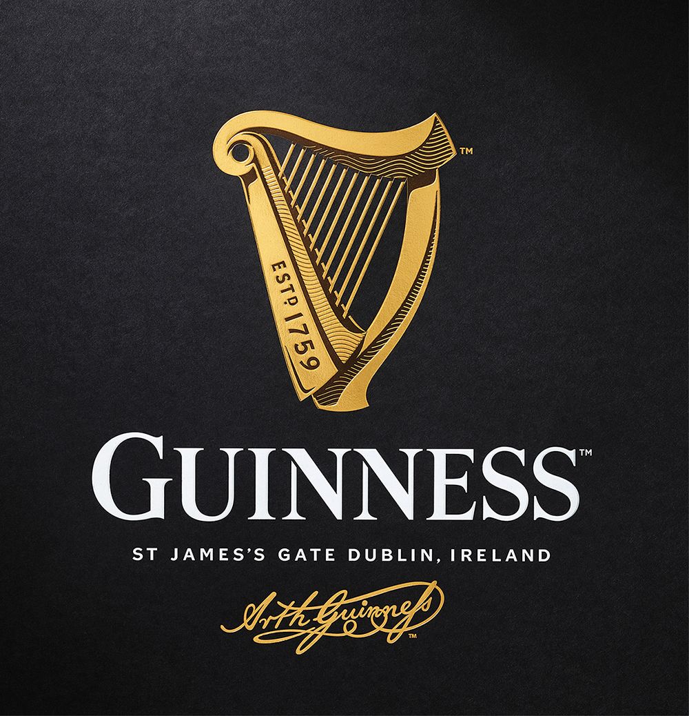
For the first time in over a decade, Guinness have decided to tamper with the iconic logo, which has been given an upgrade by London-based independent brand design agency
Design Bridge.
The changes Design Bridge have made are subtle but noticeable all the same.
Before
 After
After

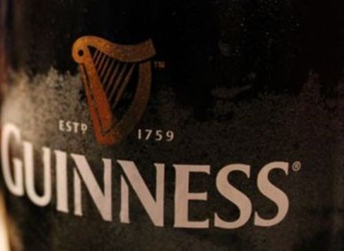
The ‘Estd. 1759’ text has now been incorporated into a far-sharper looking harp, while there’s also been a slight change to the font used for ‘Guinness’ itself.
A blurb on Design Bridge’s website reads: “It’s not often that you get to re-design one of the world’s most famous brand marks, so this project was a real labour of love and a shining example of our creative philosophy.
“The new harp is a sympathetic revolution of the original brand mark – a contemporary take on the brand’s heritage. It can work on anything from craft beers in Europe to Limited Editions in Africa and, just like Guinness itself, has true craftsmanship at its heart.
"We think Arthur Guinness would be proud.”
What do you think; will it be an instant hit or will it take a bit of getting used to?
Either way, it's making us thirsty...


 After
After
