


Life
Share
Published 12:18 30 Jan 2014 GMT
Updated 15:00 12 Nov 2014 GMT

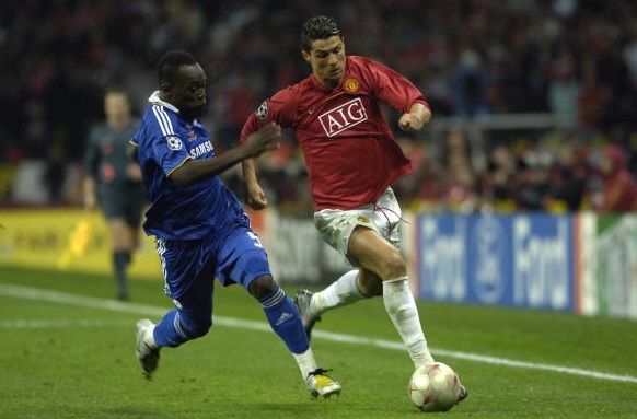
 Red home kit 2007/08
The most disappointing thing about United’s kits in recent years has been the red home kits, which have been either uninspiring or way too clever for their own good, like the tartan patch effort of last season. The jersey worn in the 2008 Champions League final got the balance just right, featuring a lovely shade of red and a nice white stripe down the back on a kit that was slightly better than the not unattractive number worn by the Red Devils in the 2006/07 season.
Red home kit 2007/08
The most disappointing thing about United’s kits in recent years has been the red home kits, which have been either uninspiring or way too clever for their own good, like the tartan patch effort of last season. The jersey worn in the 2008 Champions League final got the balance just right, featuring a lovely shade of red and a nice white stripe down the back on a kit that was slightly better than the not unattractive number worn by the Red Devils in the 2006/07 season.
 Black third kit 2007-08
Pretty much all of United’s kits were spot on around this time, with the white jersey they wore in the 2009 Champions League Final against Barcelona not too bad to look at either.
The black shirt was nearly identical in design to the red home shirt, although it did have a nice red trim along the shoulders at the front and again, the white stripe stretching down towards the arse was pretty sharp.
Black third kit 2007-08
Pretty much all of United’s kits were spot on around this time, with the white jersey they wore in the 2009 Champions League Final against Barcelona not too bad to look at either.
The black shirt was nearly identical in design to the red home shirt, although it did have a nice red trim along the shoulders at the front and again, the white stripe stretching down towards the arse was pretty sharp.
 Adidas Blue and White away kit, 1990/91
In fairness, this jersey was as close to ending up in the worst pile as it was to ending up here, but with retro all the rage these days and a quick straw poll in the office returning more yays than nays, we decided to give the thumbs up to a jersey that’s the closest football related garment you’ll find to a pyjama top.
Adidas Blue and White away kit, 1990/91
In fairness, this jersey was as close to ending up in the worst pile as it was to ending up here, but with retro all the rage these days and a quick straw poll in the office returning more yays than nays, we decided to give the thumbs up to a jersey that’s the closest football related garment you’ll find to a pyjama top.
 Black and blue third kit, 2013/14
We weren’t sure about this one when it first came out, but we have to say that it has gradually grown on us since. The rug-like pattern makes it seem almost warm and homely and we reckon this is the look United were going for with their ill-advised home jersey of last season.
Black and blue third kit, 2013/14
We weren’t sure about this one when it first came out, but we have to say that it has gradually grown on us since. The rug-like pattern makes it seem almost warm and homely and we reckon this is the look United were going for with their ill-advised home jersey of last season.

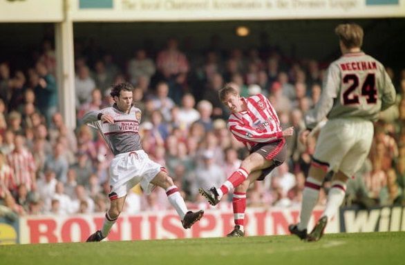 Away/Third Reversible Kit, 2001/02
Everyone remember this effort? The reversible shirt that, as if by magic, could be turned inside out to form a completely different jersey altogether? That might sound like a dream for a Sunday League team who could cut half the cost of their laundry bill in one fell swoop, but it just doesn’t cut it for one of the biggest football clubs in the world
While the white jersey wasn’t all that bad, the gold shirt on the reverse side was just all wrong, even though United wearing it did permit Clive Tyldesley to roar ‘Goldenballs’ excitedly after David Beckham netted in a Champions League game during the height of Becks-mania at the start of the noughties.
Away/Third Reversible Kit, 2001/02
Everyone remember this effort? The reversible shirt that, as if by magic, could be turned inside out to form a completely different jersey altogether? That might sound like a dream for a Sunday League team who could cut half the cost of their laundry bill in one fell swoop, but it just doesn’t cut it for one of the biggest football clubs in the world
While the white jersey wasn’t all that bad, the gold shirt on the reverse side was just all wrong, even though United wearing it did permit Clive Tyldesley to roar ‘Goldenballs’ excitedly after David Beckham netted in a Champions League game during the height of Becks-mania at the start of the noughties.
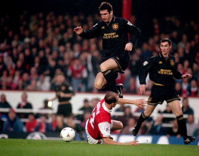
 Blue third kit, 1996/97
When United have gone blue – for the 1968 European Cup Final and with numerous commemorative shirts since – the results have generally been quite alright, but this effort is just hideous.
We wouldn’t be huge fans of the big crest in the middle and the printed Umbro logo above, but it’s hard not to be distracted by all the various lines going in all sorts of angles that make an already all-over-the-place jersey look even more ridiculously over-complicated.
Blue third kit, 1996/97
When United have gone blue – for the 1968 European Cup Final and with numerous commemorative shirts since – the results have generally been quite alright, but this effort is just hideous.
We wouldn’t be huge fans of the big crest in the middle and the printed Umbro logo above, but it’s hard not to be distracted by all the various lines going in all sorts of angles that make an already all-over-the-place jersey look even more ridiculously over-complicated.
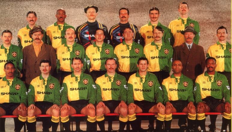
 Green and gold kit, 1993/94
No. Just no. As the colours worn by the club in its original incarnation, Newton Heath, green and gold play an important part in United’s history, but commemorating their past comrades in this way was more of an insult than a tribute.
Splitting two colours directly down the middle is a big no-no for a start and then there’s the laced collars, which looked awful and gave opposition players even more to grab a hold of when they were looking to wind up Cantona et al.
If this jersey did provide any saving grace, it’s that it did lead to this ridiculous but quite amusing squad picture; Lord knows Fergie must have taken an awful lot of convincing to wear a get-up like that.
Green and gold kit, 1993/94
No. Just no. As the colours worn by the club in its original incarnation, Newton Heath, green and gold play an important part in United’s history, but commemorating their past comrades in this way was more of an insult than a tribute.
Splitting two colours directly down the middle is a big no-no for a start and then there’s the laced collars, which looked awful and gave opposition players even more to grab a hold of when they were looking to wind up Cantona et al.
If this jersey did provide any saving grace, it’s that it did lead to this ridiculous but quite amusing squad picture; Lord knows Fergie must have taken an awful lot of convincing to wear a get-up like that.
 Red home kit, 2012/13
It was a close call between last season’s home jersey and the rugby-league inspired number with the black stripe worn in 2009/10, but after the amount of ridicule that greeted this effort last year, this is our choice and we’re sticking to it.
We get the idea behind the tartan design, particularly with Alex Ferguson still in charge and such a strong Scottish connection with the club, but not alone did it not work, it also seemed to be unnecessarily shiny as well. Not many United fans would have been disappointed to see this one go, that’s for sure.
Red home kit, 2012/13
It was a close call between last season’s home jersey and the rugby-league inspired number with the black stripe worn in 2009/10, but after the amount of ridicule that greeted this effort last year, this is our choice and we’re sticking to it.
We get the idea behind the tartan design, particularly with Alex Ferguson still in charge and such a strong Scottish connection with the club, but not alone did it not work, it also seemed to be unnecessarily shiny as well. Not many United fans would have been disappointed to see this one go, that’s for sure.

Explore more on these topics:

Life
life style

Life

Life

Life

Life

Life

Life

