And why there’s been a shift…
It seems that the colour of fast food signs is tremendously important and some colours have been subliminally etched into our minds to represent certain things.
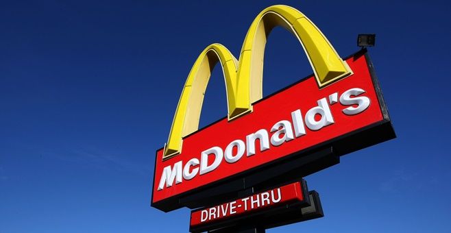
Red and yellow colours have become synonymous with fast food and for many people when they think of the two colours, inevitably it’s fast food that pops into their head.
Brought to our attention by Indy100, Karen Haller, an expert in applied colour psychology, has discussed the psychological effects that these two colours can have people.
McDonald’s have historically had a red and yellow sign, although this has changed somewhat in recent years (we’ll discuss that later).
“The feelings, the mood this combination of colours emits is perfect for their target market,” Haller said.
“Looking at the positive psychology qualities of red & yellow in relation to the fast food industry, red triggers stimulation, appetite, hunger, it attracts attention. Yellow triggers the feelings of happiness and friendliness.
“When you combine red and yellow it’s about speed, quickness. In, eat and out again.
“Yellow is also the most visible colour in daylight, which is why the McDonald’s M can be seen from a far distance.”
But you’ve probably noticed a change in the branding of McDonald’s in recent times and this gives off a different feeling according to Haller.
“Green elicits the feelings of nature, natural and environmentally friendly. It’s no longer about rushing in for a quick bite to eat. You can relax, get comfortable, linger over a coffee (almost dare I say, a bit like Starbucks).”
LISTEN: You Must Be Jokin’ with Aideen McQueen – Faith healers, Coolock craic and Gigging as Gaeilge
