Uefa unveiled the official brand logo for the 2016 European Championships today and in fairness to them, it doesn’t look too shabby at all.
The tournament in France doesn’t take place for another three years but you’d better get used to the sight of the logo because you can expect to see it quite a lot between now and then and to be fair it actually looks OK and might yet rank alongside similar emblems like the brilliant stick-man from Italia ’90.
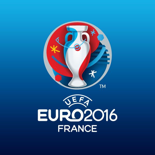
According to the Uefa press release, the logo was conceived by Brandia Central, the Portuguese agency behind the UEFA EURO 2012 insignia and, blah, blah, blah, is a representation of various art movements and football elements, all centred around the iconic Henri Delaunay Cup.
All of those details, along with some more guff about the red, white and blue lines of the French flag producing a contemporary and bold style will soon be forgotten by most observers, who will soon notice that, when all is said and done, it’s just a big smiley face really.
Not a bad effort lads, not a bad effort at all.